8 January 2010

Animated visualizations: Don't change the scale!!

I have an unhealthy obsession with weather - partly because we heat with wood, and partly because if it snows enough I get to use the snowblower on the front of my lawn tractor. Consequently I often have the weather radar  up on my browser.

By default, wunderground.com (and most others) show only the most current radar image - other than a total storm size I can pretty much look out of my window to get the same information.

By animating the map, I can see direction of movement - key if you are at the edge of the storm, and very important if it's a coastal storm which tends to sit and rotate rather than moving off. Equally I get to see the speed of the storm's movement, another important variable, and how the intensity of the storm is changing, denoted by the key on the right.


And here's the cardinal sin - if you're going to animate anything with a scale, don't change the scale halfway through the animation.

The initial scale has a number of shades of grey below zero (that really could be replaced with just one color, as this just means clouds with some snow blowing around).

5dBZ on the first scale (light snow) is a dark green. As the intensity of the storm passes a threshold a switch is made to the second scale. Now anything below 10dBZ is light grey, and interestingly, as is anything above 60dBZ. The second scale now also has some descriptions of the intensity. The new scale fails color blind users to a certain degree (mouseover to see) - the 45dBZ plus now looks very much like 15dBZ.

This isn't wunderground.com's fault - I would guess they pull the images from NOAA. I would also venture to guess the change in scale is as a result of the internal workings of the radar changing. Whatever the reason, software creates the scale, so it could be fixed.

One fix: as a change in scale is needed, create two images, one with the old scale, one with the new, for the period of time that that the animation covers. When you have enough frames switch over so that the animation only uses one scale. This isn't a great fix as that scale change will still confuse when viewing over longer time periods or intermittently through the day.

Much better would be to just have one scale (right) - as a member of the public (rather than a pilot for example), I don't think the values below 0dBZ, or above 65dBZ, mean much to me, so you could probably lump all of those into a bucket or two. I've still used a green to red scale, but identified the 'catch all' buckets at the top and bottom with colors outside the gradient. I've also extended the color range through purple. The greens have a lot more blue in them to help colorblind users (mouseover). A few other improvements - specify time between frames so that I can understand velocity (I always have to try to catch what the clock movements are), and state when the most recent picture was taken (not just the time of the current frame).

5 January 2010

Exploring crash statistics - an excellent interactive visualization


This series of interactive visualizations by the BBC is quite stunning. The first shows a map of fatal car accidents in the UK. For the area chosen you can see age, sex, and vehicle type breakdowns. Mouseovers show details of the accident as well as links to the news story about it.

The year slicer on the bottom is excellent, allowing you not only to quickly jump between years, but also to see how accidents vary over the months in each year. My only wish is that you could show the markers for all years, allowing you to better identify accident hotspots, and that they superimposed a line across years to show a trend of total accidents.

On another tab, they have the breakdown of accidents by time of day. The buttons on the side allow you to see the pie chart and time of day statistics by the category chosen. A pie chart is not my first choice here - a bar chart would be better, but you can click a section of the pie to show the time of day data by just that segment - mouseover the image below to see when young people kill themselves vs. the older population. I think the radial bar chart works very well in this case, especially with the radial gridlines.


In a previous career I was a consultant focusing on fatigue and safety, so these data are of particular interest to me - for example, if you select vehicles, then the pie segment for goods vehicles, you can see the spike in accidents at 4AM as truckers fall asleep at the wheel and crash. The only thing missing (which you rarely see in data like these) is normalization - the risk of driving in the early hours is so much greater than at other times of the day considering the amount of traffic. An excellent example of data visualization.

29 December 2009

What will the third dimension bring to data visualization?


I have just started reading Edward Tufte's Envisioning Information. In the first few pages he discusses how we are immersed in a three dimensional world, but our data is stuck on two dimensions, whether on the screen or on paper (3D effects on bars or charts with a third axis do not count..)

The concept of 3D TVs is beginning to take off, with many vendors pushing 3D-ready sets. While glasses-less 3D is a way off, I wonder how this will affect 'standard' data visualizations - I'm not sure that a bar chart with data on a Z-axis that you can actually look around by moving your head, will be much better than the fake 3D ones today that you can rotate around with your mouse.

Perhaps we will start to see 'Sparksurfaces™' instead of 'Sparklines' - move your head to see the data plotted against another variable. I have a suspicion that there won't be any great advances in data visualization, rather we will see even slicker, eye-popping dashboards and charts that may, or may not, be easier to read. Your thoughts?

22 December 2009

What the customer needed..


It's pretty much inconceivable if you work in software that you haven't seen this picture posted up in your lunch room at some point. It is of course a witty look at why the software process doesn't always produce the expected functionality in the most elegant and economical fashion. Depicted are a variety of parties that must share the blame for how the end product differs from what the customer needs.

For the most part it's a reflection on communication and how personal perceptions lead to differing end results. However, when I look at it, the most striking point, and the one that I feel is most overlooked, is that the customer's description and what they needed (first and last panels) are subtly, but distinctly different. This I feel is the problem with lots of software design - the customer does have a concept, a feeling, for what the software should do, but finding a customer who can vocalize this into specific functionality rarely, if ever, happens. Turning to the customer to provide feature lists or functionality is an easier way out than stepping back and making a decision about the business problem that is being solved. What does the customer really need? What do the potential customers I have yet to sell to really need? How can I quickly, economically build that, and not get sidetracked into other features that are affiliated but take away from my concentration on the main business problem?

18 December 2009

#uksnow - plotting Tweets on a map

The UK is currently having its once every ten years snowfall. Like many places that rarely get snow, this is not only a big deal, but makes travel near impossible. There will be SUVs littering the ditches by day break.. What has been interesting is watching how social media reports this - one person has taken this further and is plotting tweets of snow reports - users tweet their postcode and on a scale of 0 to 10, how much snow is coming down.

While it a great example of what can be done with clever programing and social media, especially during an unusual event, the actual visualization produced isn't very useful - there's no indication of the age of the tweets - i.e. whether this reflects the last 10 minutes or the last day. This is important especially when the data will vary greatly from hour to hour - "how much snow is falling now".

When data is plotted that has any time component, you need to indicate the 'freshness' and the 'aging'. Also, there isn't any normalization for number of users - so London looks like a hot bed of snow activity. If this were something more serious, a better way to represent this would be to break the country down into less discrete areas (e.g. counties), and color these based on snow reports, rather than plotting individual tweets. This would reduce the influence that number of tweets has on the look of the map. Areas where there was no data would have to be able to be distinguished from areas of no snow.

 Even better would be to have an animate option where you could watch the progress of snow fronts across the country over the last day. Still, I like it - imagine doing this with power outages during an ice storm (updates via phones I suppose), progress of wild fires, etc. There could be some really useful information as long as enough people take part.

11 December 2009

Pareto lines on bar charts - an Excel fudge


I found this aberration the other day on 148apps.biz. It's a pie chart of showing the categories of the apps available on the Apple website. I won't labor on why it fails, but the multiple slices, oblique view, lack of color blind sensitivity, and 0% pie pieces add up to a awkward chart.

While not 148apps fault, the choice of categories that Apple has made available makes the chart less usable - some should clearly be subcategories - strategy for example is probably a game category. 


A bar chart is a better choice - even better are bars with a pareto line showing that the top five categories account for x% of the total apps available. You can add a pareto line to a column chart relatively easily - add a new series (the cumulative percentages that you've calculated) to the column chart, change the chart type of just this series to line chart, and place it on a secondary axis.

However, you can't do this with bar charts as the line can't be plotted on a secondary axis when it's in this orientation.

Instead you are doomed to fudging a solution - plotting an XY line with the X coordinates matching the cumulative percentage, scaled up to match the current full scale (20,000), and Y coordinates that correspond to the position of the category labels. These Y coordinates are quite easy to calculate - if I have 20 labels, the Y position of the first point will be 19.5, the next 18.5, and so on. Copy and paste the new XY data in, change the chart type of this series to XY,  and ensure that you don't have to swap the X and Y column. Excel will add the data with a new Y axis - edit this and set the maximum value to the number of categories (20) - this  lines everything up, then delete this extra axis. I had to add the 0%, 25%, 50%, etc. to the bottom as text boxes.

Download the Excel file here. And yes, those are miniature iPhones making up the bars..

Where in the world (are pie charts popular)?


In my prior post I used data from Google Trends to look at how to summarize complex data. The data I pulled compared how often "pie chart" is searched for compared to "bar chart". In this data set you can also compare the relative search popularity by country. The data is normalized to the number of overall searches coming from that country.

While I was just using these terms to get a data set, this information is actually also interesting - Relative to all searches in a country, India's users are twice as likely to be searching for either pie chart or bar chart. Does this mean that India has more studious users while US users are occupied by searching for the latest Tiger Woods news? I don't know how language is accounted for - if the normalization just for searches in a single language this would explain the difference, as English language searches would more likely to be conducted by business users. This brings up an important point about knowing exactly how data is 'manipulated' prior to drawing any sweeping conclusions.

I've added a second series (green dot) that compares the relative popularity of bar vs. pie (pie chart popularity/bar chart popularity) within a country. Interestingly, "bar chart, is almost searched for as often as "pie chart" in India, the Philippines, etc. compared to the US, where "bar chart" is half the search volume of "pie chart". Go draw your own conclusions about that.

7 December 2009

Visualizing data that obscures trends (pie charts are "better")

I've been playing around with Google trends for a while now. It's an incredibly powerful tool for market research, especially when you're looking at new markets, or how the popularity of a brand is changing.  You can look at how a particular search term has trended over five years, where the term is more popular (countries, cities), compare several search terms, and how news stories that bear relevance to the search terms may have impacted the search volume.

The search terms I chose to compare for this example were "pie chart" and "bar chart", partially in response to the friendly back and forwards that Chandoo and Jon Peltier have had recently concerning appropriate use of pie charts. My data adds nothing to their conversation apart from what the public considers 'search worthy', so apologies for the misleading blog title, but the data are perfect for demonstrating how you can better visualize data that have seasonal and other variations that hide overall trends.

Here are the data - relative search popularity of the two terms on a week to week basis since 2004. Some things come out immediately - people search for pie charts more than they search for bar charts. There seems to be seasonal variation within each year, and there seems to be a trend over the years. To investigate these trends further I summarized data by month/year/etc. by grouping the dates in pivot charts.


Here's the seasonal variation - taken by looking at the average search popularity by month of the year, across all five years. Both terms are searched for less in the summer (for the northern hemisphere, but the data are overwhelmingly dominated by users in this hemisphere), and at the end of the year. This would coincide with both school holidays and lower business search volume (as people take vacations). The lines suggest that "bar chart" is less affected during the summer than "pie chart". To confirm this, I've added another series that compares how the two terms vary compared to each other. If the bar for a month is lower than 1, "bar chart" has dropped less relative to its average popularity over the year when compared to "pie chart", so yes, even when you account for the fact that absolute height variation of "pie chart" is greater, "bar chart" does not experience as great a drop-off mid-year.

As a nod towards the bar-chart vs. pie chart argument, perhaps one could argue tongue-in-cheek that "pie chart" is searched for by school children more than business users as the drop-off is larger in the school summer vacation, so therefore bar charts must be more important to business.. No, probably not.

Before we move on though, a quick comment on what we've lost from the 'raw' data. From our summary chart you could conclude that the search volume is about the same in December as it is in the summer months. However, look at the top chart - search volume only drops in December in the last two weeks of the month, whereas search volume is lower for every week of July. For that reason, you must carefully consider the level of summary you chose, whether an average or sum is better for comparisons, and whether you should also show the raw data.


Next we have year to year variation. There is a dip in 2006 and 2007 (for which I have no explanation..) The pattern is the same for bar and pie searches. It is likely to be a reflection of real search volume, not a collection artifact, because two unrelated search terms do not show this dip. I wondered if "bar chart" was catching up to "pie chart", so the line compares the absolute difference. Interestingly, without the average line plotted across, it really looks like this line is dropping - "bar chart" is catching "pie chart" up, but it's misleading - because both the other lines are headed upwards, even a straight-ish line looks like it's dropping. The addition of the straight average line reveals that there is little, if any catching up being done.

Similarly to the prior chart, you have to be mindful of what you've lost in this summary. If you use an absolute count of searches, rather than an average then the results will be different to some degree (and not only because we are missing December 2009 data).

I did also plot these data by day of the month - searches are more slightly popular towards the beginning of a month, but I would attribute that to the two main US holidays, Thanksgiving and Christmas, both occurring the later parts of the month.

How else could you summarize these data?

30 November 2009

Charting data with one disproportionally large value

Datavis tweeted about a fun chart he found comparing 'kills' between the top animals - I'm not sure the data are meant to be real or what 'kills' means, but the point is made that humans are by far the worst offenders. Part of the emphasis is that the human number is literally 'off the chart'.

It got me thinking about how to show data like these - where you  have one very large number and other much smaller numbers. There are two things that people may want to know- how much bigger the single point is than the others, and then how the others compare. I've thrown together a few ways you could do it:


Top left: default scaling - it certainly gets the point across that one value far eclipses the others, but you can't really compare the others, or put numbers to them.

Top right: log scale - often espoused as a solution, but frankly I can't stand it. Most people don't get log scales, and I find myself looking to the axis to compare values - I may as well just have the values in a table. It's also difficult to compare small differences between bars.

Middle left: breaking the axis - you can't really visually see how much bigger the human contribution is, but the point is made that it's much bigger, and you can still compare the smaller values. There is no way in Excel to do this automatically - you can limit the axis max of course, but there's no indication that the bar continues upwards.

Middle right: two charts - Arghhh, my eyes, a pie chart and some bevel effects. Actually I quite like this - pie charts are fine for comparing two values if you're not trying to read the exact comparison from them, though the numbers are needed. As for the bevel effect - I blame that on the excesses of Thanksgiving..

Bottom left: aspect ratio - simply enough, make the chart so long that you can compare the smaller values. Even on web only presentation this is a difficult one because of the real estate used up - that is, unless you use this space for other content.

Bottom right: just imply a continuation - similar to the broken axis, and similar to the original chart that Datavis tweeted, but with the actual value shown. Needless to say, this is not a default view in Excel..

Any comments on these, which is your favorite? How would you address this challenge for a dashboard vs. print publication?

24 November 2009

Visually exciting and useful? Google's image swirl

When I find a new visualization or graphically based tool on the web, I like to jump straight in without looking at what it's supposed to do, or for that matter, how it's supposed to work.


Google's image swirl is superb - so obvious, and yet very useful. Search for an image - e.g. Statue of Liberty, and it gives you a selection of stacked images, with each stack having a different image characteristic - aspect ratio, colors, light level (night/day), for example. Select one of these and you can drill down further until you can get to a range of images that all are pretty similar, jump back up a level if you still want to refine it. In the example above I've navigated to pictures taken at day that also have nice fluffy clouds and the Statue of Liberty (or some interpretation of it)

22 November 2009

Excel 2010: Sparklines, not too shabby

There's been some excitement in the data visualization world about Excel 2010's sparkline implementation (we're an easily excited bunch), and less excitement about a patent application that Microsoft has applied for concerning the sparklines (lots of prior art). Anyway, I've played with them a little - they are pretty robust and for a first implementation, far better than their first attempt at in-cell bar charts in Excel 2007.


There are your standard sparklines (if there is such as a thing), columns, markers on the sparklines, such as high, low, first, last, and a win/loss variant. They are missing banding showing a desirable range of values, but the options for controlling the axes are nice. Something which is very nice is that when you create a single sparkline, and then copy the cell down it treats it as a formula and adjusts the data, but the sparklines are then treated as a group, making editing and axes manipulation very easy.


It will certainly be nice to not have to include macros to allow clients to view sparklines that you've created, but there is still plenty of room for the excellent free and paid sparkline add-ins that exist today.

20 November 2009

Good charts and humor?


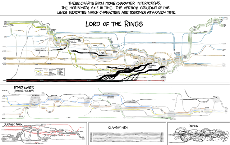
XKCD.com  often delivers amusement, but now I get to include it on my business blog - look: charts and humor all in one place. Could it get any better (rhetorical).

Excel 2010 in-cell bar charts (are much better)

I've posted before on my opinions about Excel 2007's in-cell bar charts, and mentioned that Excel 2010's are supposed to be much better. Well, having got my hands on the beta version yesterday, I can say yes, yes, yes, they are much better. The gradient option is still there, but is not a default. Zero, and very low numbers compared to other numbers in the range have no bar height (see examples A and B below), AND there's no option to turn on the fake bar height.


Negative numbers in a range result in an axis being drawn, and the bar appearing the other side of the axis, in a different color (D). You have full control of colors of the axis and bars. But, wait, there's more. You can control the max and min of the chart - great if you have multiple in-cell bar chart ranges that you want to be able to compare.

You can't have the bars offset from the data as they are a conditional format, but you could just slap in a formula where you want the bar: "=cell where the data is", and then click the option to show just the bar, not the data (E). Even the gradient option is better, as there is a border by default allowing you to see where the end of the bar is (C). Finally, the resolution of the bar (i.e. when a bar height goes to zero), depends on the width of the cell (B). Great job Microsoft.

19 November 2009

You shouldn't notice good design

Sometimes software design and data visualizations wow us with their grace and beauty. I would argue though, for most of the time, we don't even notice when something just works in the way it should. Quick example - if you have multiple tabs open in Google's Chrome browser and you close a tab using the x on the tab, the next tab slides across and places the next x right under your mouse, so that you quickly can close the next as well.  But here's the great thing - if you have lots of tabs open so that they have been squeezed up, and close multiple tabs, it will wait before resizing the tab so that you can continue to close tabs without moving the mouse

Firefox sort of does this except when it comes to delaying the tab resize. Internet Explorer makes no attempt to decrease your mouse movements. Little things...

18 November 2009

Insights by IBM


Came across this in The Economist (who, by the way have consistently good charts that don't discriminate against color blind readers). The gist is that IBM can organize your financial data from disparate systems into reliable, transparent, actionable information.

Is the 'chart' they show a result of not buying their software, or what you get when you do? I know it's just marketing fluff, but when you provide people with concepts like this, no wonder they are happy with revving gauges.

Actionable indeed...

ShareThis