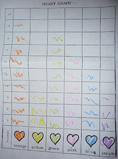
Being in the data business, I tend to critique most charts or visualizations I see. I am pleased to note that not only is my son's kindergarten already pushing an understanding of data, but that so far the charts have all been of the bar variety.
While of course one could labor on the excessively strong grid lines reducing the data-ink ratio, I think I'll let it slide this time.
I do hope that pie charts aren't being reserved for 1st grade as they are "more advanced"..
If your business has data that you would like to know more about, maybe you need some bar charts hand crafted by me (or my son) with crayons, or possibly very robust tools like Tableau Public.
22 February 2010
Subscribe to:
Post Comments (Atom)

Functional AND attractive. What's not to like?
ReplyDeleteLook at the charts they are saving for college.
ReplyDeletehttp://bit.ly/8Xfr5p
@Naomi - nice paper. "How is our children learning" when these are the 'best' examples?
ReplyDeleteAlmost looks like in-cell charts (sparklines).
ReplyDelete